I started working at doxy.me shortly after the COVID pandemic began. The company was growing from a relatively small side project to the leading provider of telehealth solutions, especially for small clinics and solo practitioners. I was brought in primarily to work on the Clinics feature which is basically doxy.me's version of "enterprise".
While my time there was short, I managed to pitch a complete re-org of the Clinic portion of doxy.me and pitch a new Analytics section.
My role at doxy.me was Senior UX/UI Designer, and while I was there I reported to a UX Design Manager. I also had access to a well-staffed research team.
doxy.me was initially a side project - an easy way for solo practitioners to set up secure video conferencing with patients. When I joined the scope had grown to include clinics which would add a ton of complexity. New features would be needed such as:
- Multiple healthcare professionals working together
- Allowing professionals to maintain independent practice while also being a part of one or many clinics
- Complication of personas including new buyers, tech, and admin roles
- White labeling
First, I set out to tackle the problem of the app's information architecture.

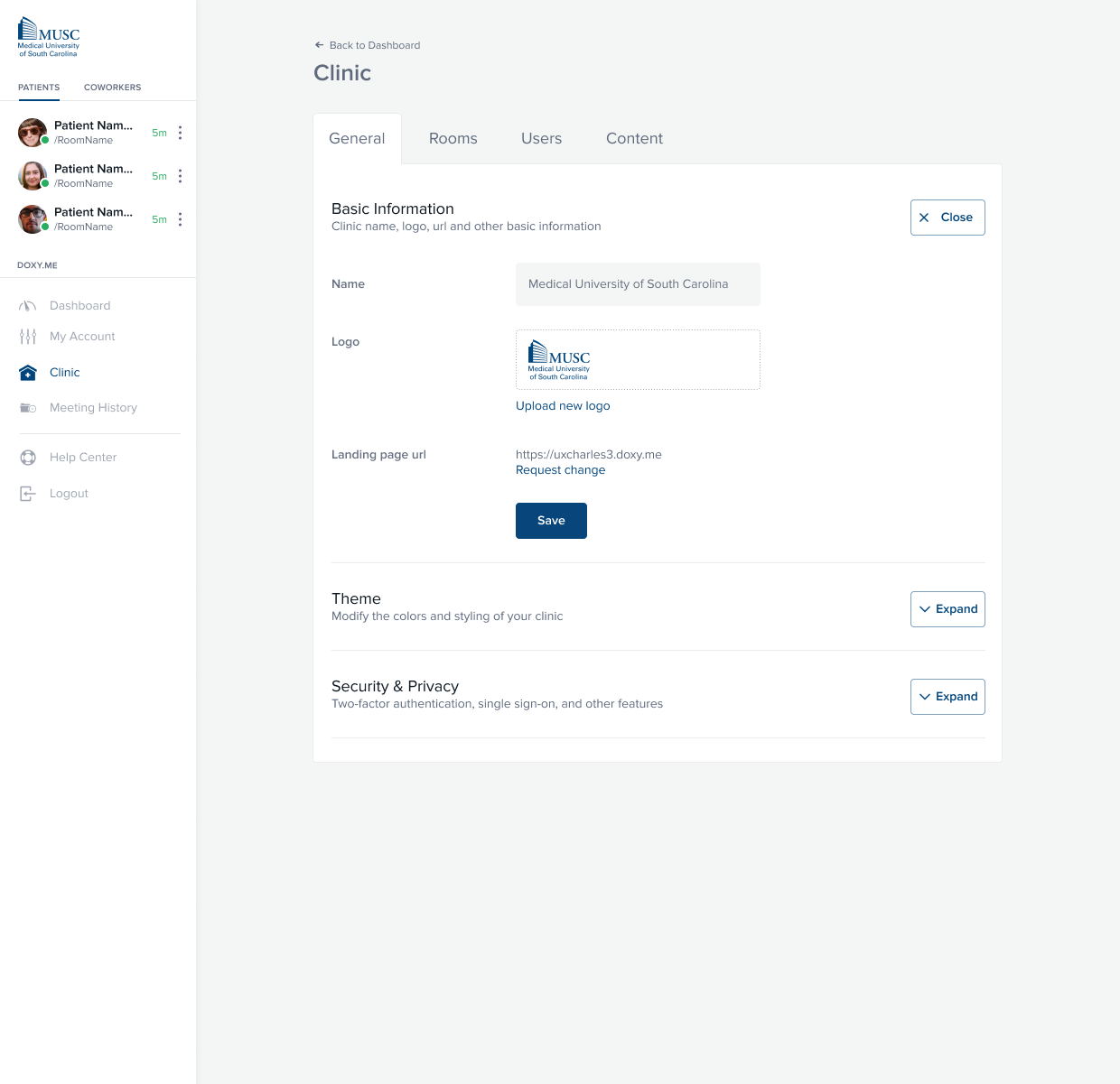
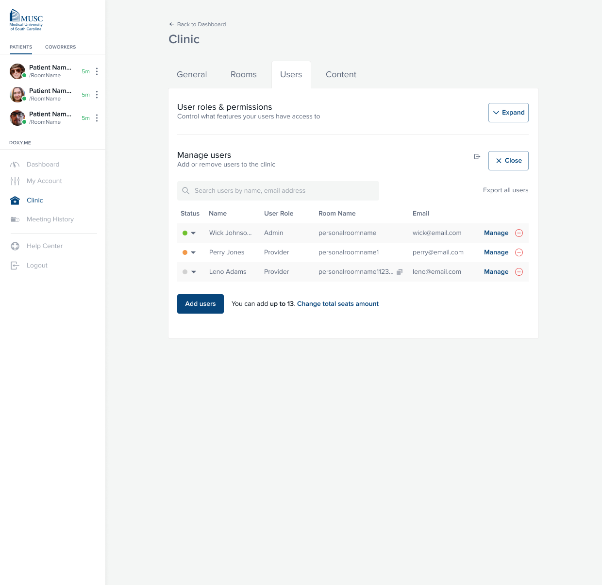
Ultimately, the main problem with doxy.me's IA was that Clinic features, while they were being hastily developed and implemented, had largely invaded the space of individual user spaces.
- Clinic settings were placed at the same level as an individual user's personal account settings, if that user happened to also be the admin of a Clinic
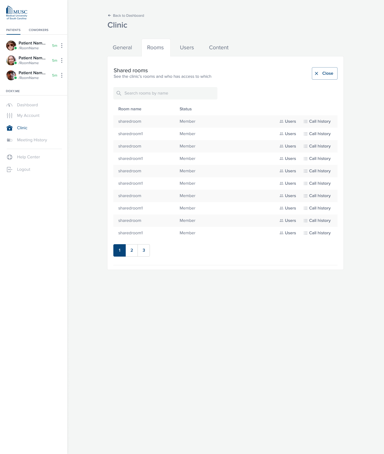
- Because the only "Clinic" section lived within the admin's personal settings, there was no area for other employees to go to see data that might be available to them such as contact information for coworkers and patients
- There was no simple way to see who else was working at your clinic, forcing users into third party apps like Slack
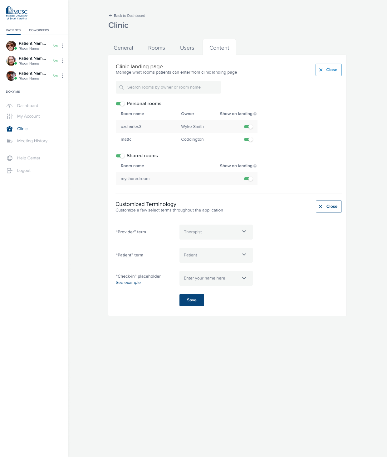
Untangling Clinic from individual accounts a bit helped solve a lot of these problems, in addition to issues with features and requests that were in the pipeline. For example, at this time the #1 request from Clinics was the ability to make "community rooms" where anyone could pick up a patient if they were available (think online waiting room).
The resulting screens don't have much wow factor aesthetically, but the relief of seeing it all together for the first time was pretty great!
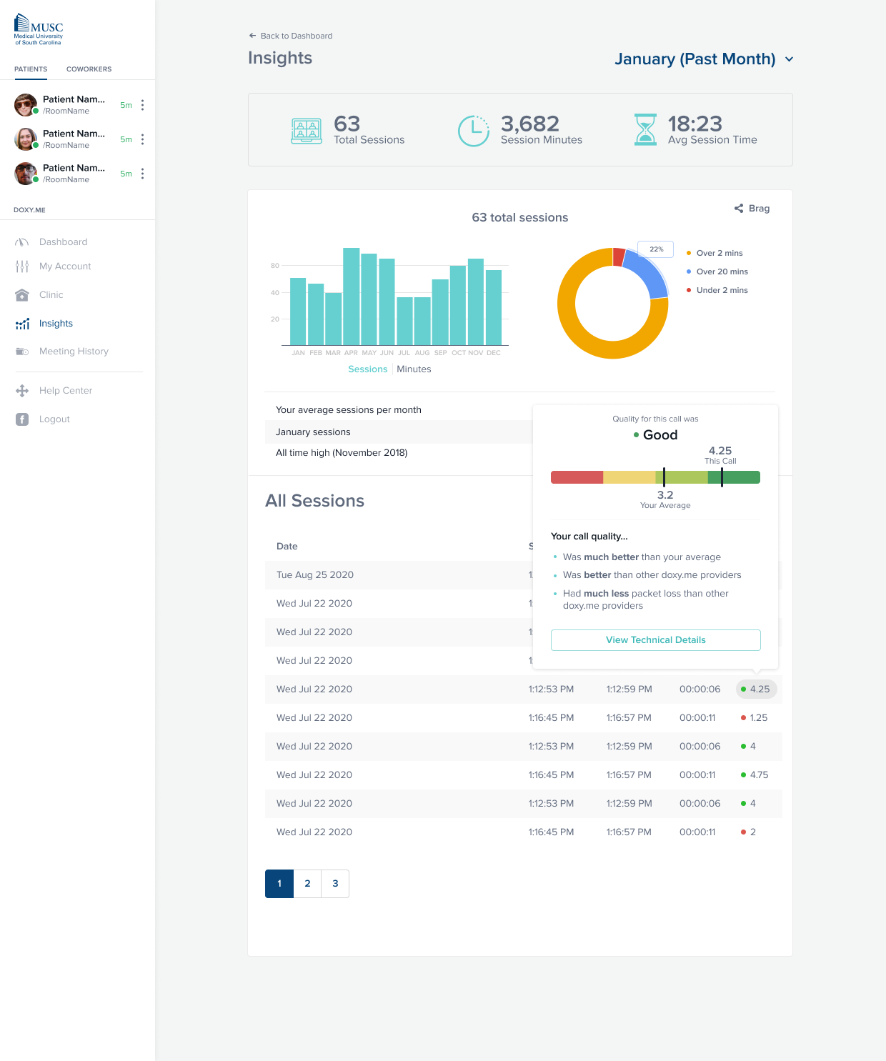
Another large part of the Clinic redesign was adding some sort of concept for "analytics". While this was mostly speculative and didn't make it to production while I was there, I think the work turned out well.
The main purpose behind having an analytics page was to help users, both individual and Clinic admins, pinpoint the value that doxy.me was (or wasn't) adding to their business. Telehealth at the time was a new cost for providers, and users were wary to spend too much on premium features and were hesitant to move more business to the platform.
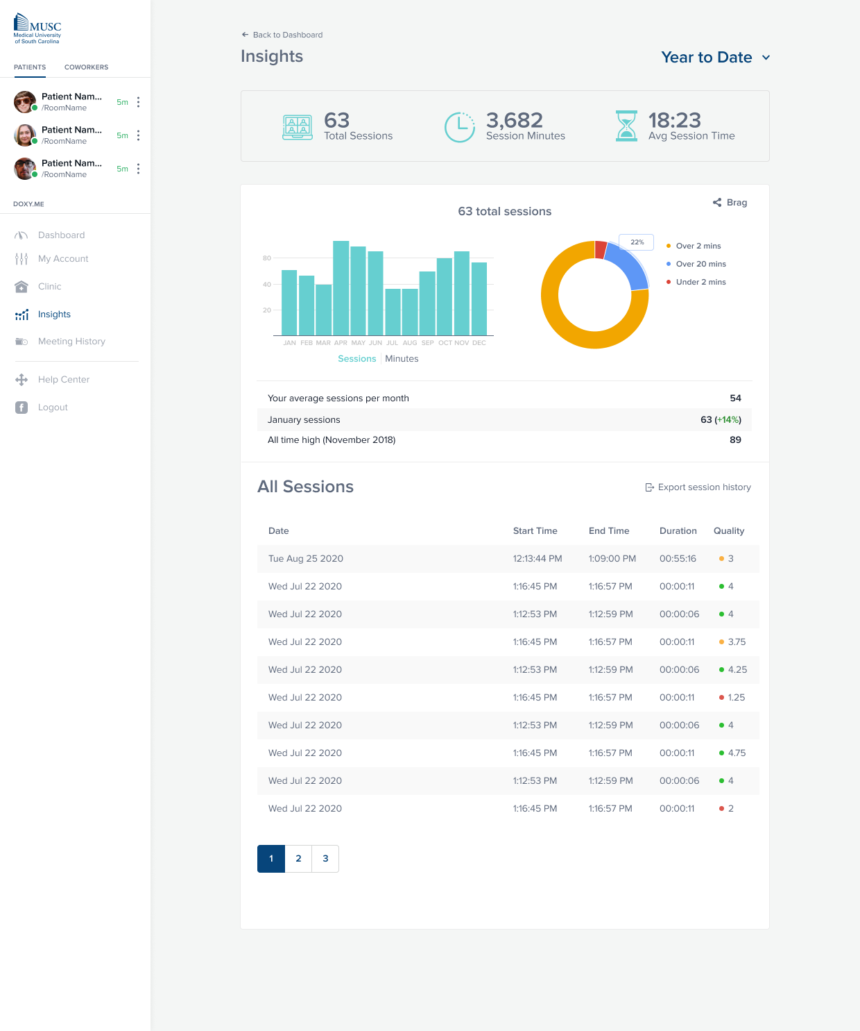
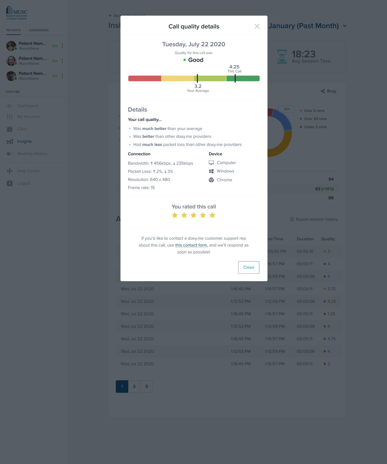
Doxy.me put a lot of work into making sure calls maintained good quality throughout. Unlike most video conferencing, it's extremely important for telehealth calls to maintain good quality. These calls are medical consultations and could include visual diagnosis. Part of maintaining that quality is making that data transparent to users in a way they'll understand and can take action on.