As Corsair TMS was getting ready for its initial launch, leadership decided it would make sense to build out an abridged version that would allow users to fetch rates in a fast and lightweight app.
This app, called Corsair Lite, would supplement the main app by letting users bypass most of the setup needed to get a look at some of Corsair's rating results. It would also act as a bit of a demo that would hopefully encourage users after a successful rating to sign up and try out the full application.
For this project I was a Senior UX/UI Designer at Rygen. I was the sole designer for the entirety of the project and had support from a small product team and a very experienced engineering team.
"Getting Rates Quickly" essentially sums up the purpose of the application. Users, whether authenticated or not, can access Corsair Lite and quickly generate broad rates for expected shipments. If they like the prices presented they can continue through the booking process. If they don't, they can keep shopping or modify their shipment.

By far the biggest challenge of this app was the sheer amount of input required by the user just to generate any rates at all. Since the goal of this app is to primarily entice potential users into subscribing to the full Corsair TMS by returning rates quickly, it was important to reduce the needed input as much as product would allow.
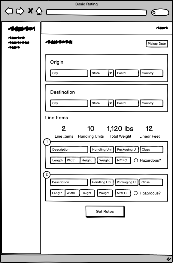
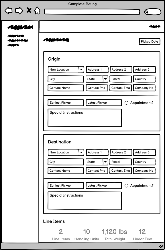
So I ended up with two versions of the input screen:
- First, the absolute bare minimum data required to return useful rates. This is what users would see when initially landing on the app.
- The second screen would show after the user selected a rate they liked. This screen includes more details required to get the actual *exact* rate for the shipment. Ideally this rate wouldn't be far off from the initial one, but since there's a chance it could be, this additional information is needed.


